A cancel flow is the sequence of screens a customer sees when they try to cancel their subscription. Most SaaS companies treat it as a formality - a confirmation modal, maybe a dropdown asking why, then done.
That's leaving money on the table.
The best cancellation flows save 15-25% of customers who initiate cancellation. They do this by understanding why someone is leaving and offering a relevant alternative - not by adding friction or dark patterns.
I've analyzed dozens of SaaS cancel flows. Below are 6 examples worth studying, what makes them work, and how to build one for your product.
Table of contents
- TL;DR
- What is a cancel flow?
- The 5 elements of high-converting cancel flows
- 6 cancellation flow examples (with breakdowns)
- Cancel flow comparison table
- Cancel flow benchmarks
- Dark patterns to avoid
- Building your cancel flow for Stripe
- Implementing your cancel flow: a checklist
- FAQ
- Conclusion
TL;DR
- A well-designed cancel flow saves 15-25% of cancellation attempts (src: ProsperStack)
- The best flows include 5 elements: exit survey, value screen, personalized offers, pause option, clean exit
- Value screens (showing what the customer has used) are underutilized but highly effective
- Match retention offers to cancellation reasons - don't show discounts to everyone
- Avoid dark patterns - they create angry ex-customers who damage your reputation
- Your cancel flow should feel helpful, not like a trap
What is a cancel flow?
A cancel flow (also called a cancellation flow) is the series of screens between "I want to cancel" and "You're canceled." It typically includes:
- An exit survey asking why they're leaving
- A retention offer based on their response
- A confirmation screen
Simple cancel flows are just a confirmation button. Sophisticated ones are multi-step experiences that surface the real reason for churn and offer personalized alternatives.
| Cancel flow type | Save rate | Best for |
|---|---|---|
| Simple (1-click confirm) | 0-2% | Free products, low-touch |
| Basic (reason + confirm) | 5-10% | Early-stage SaaS |
| Full flow (survey + offers + value) | 15-25% | Subscription SaaS, high LTV |
The 5 elements of high-converting cancel flows
Before we look at examples, here's what the best cancellation flows have in common:
1. Exit survey
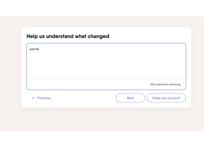
The first step captures why someone is leaving. This data drives everything else - you can't offer relevant retention options without it. See our exit survey template guide.
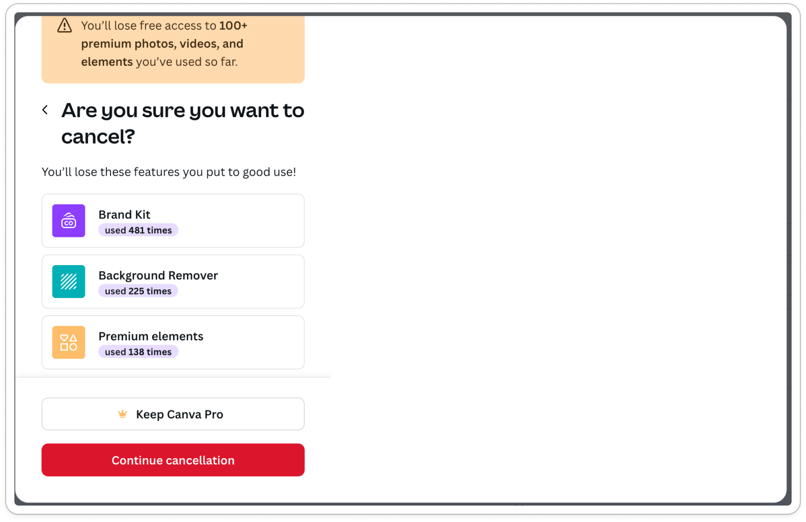
2. Value screen
Shows the customer what they've accomplished or used in your product. "You've created 47 designs this month" or "Your team has logged 230 hours." This triggers loss aversion and reminds them what they're giving up.
This is the most underutilized element. Most cancel flows skip it entirely, but it's one of the most effective at making customers pause and reconsider.
3. Personalized retention offers
Different reasons require different offers:
- "Too expensive" → Discount or downgrade option
- "Not using it enough" → Pause subscription
- "Missing features" → Roadmap preview + pause
- "Switching to competitor" → Feature comparison
Showing the same offer to everyone wastes your best retention lever.
4. Pause option
For customers who aren't ready to commit but aren't ready to leave permanently, pausing is the perfect middle ground. Their data stays safe, they can return anytime, and you avoid a full churn event.
5. Clean exit
If someone genuinely wants to cancel, let them. No hidden buttons, no phone call requirements, no "we'll get back to you in 48 hours." A clean exit creates goodwill - these customers may return or recommend you despite leaving.
6 cancellation flow examples (with breakdowns)
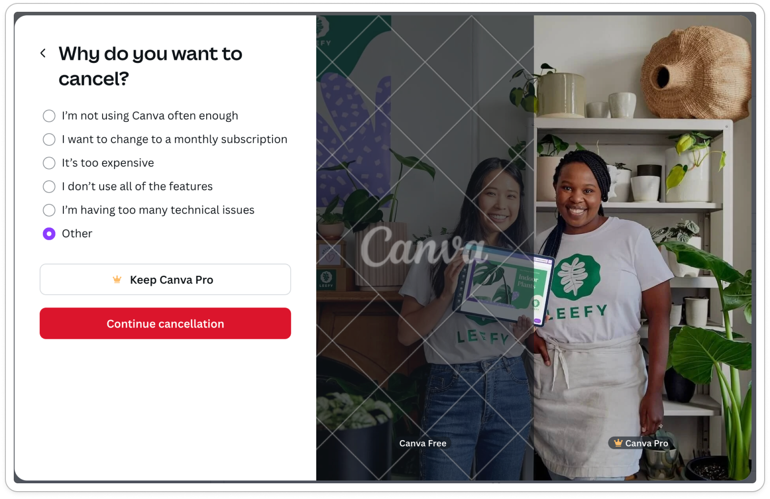
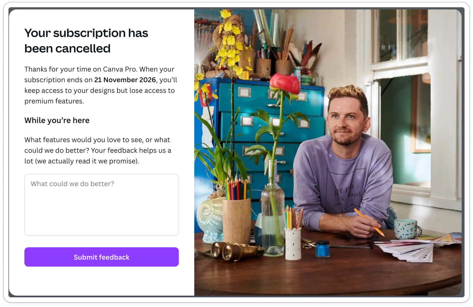
1. Canva - best pause-first approach
Canva leads with a pause option as the very first screen - before asking why you're leaving. Then they show a personalized value screen based on your actual usage data.
What they do well:
- Pause option appears first (catches "not using it enough" customers immediately)
- Personalized value screen shows your specific usage stats
- Value screen triggers loss aversion before the exit survey
The flow:
- Pause option (first screen)
- Value screen (your usage stats)
- Exit survey (why are you leaving?)
- Confirmation
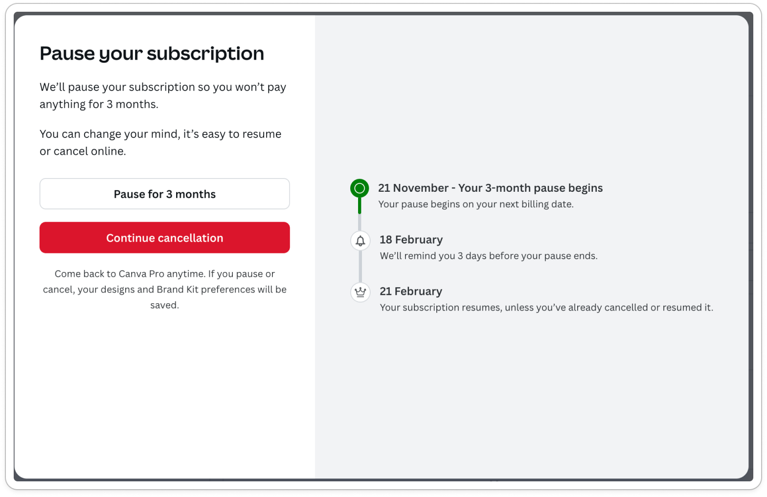
Canva cancel flow
Steal this: Lead with pause. Many customers aren't ready to commit but aren't ready to leave permanently - give them the middle ground immediately.
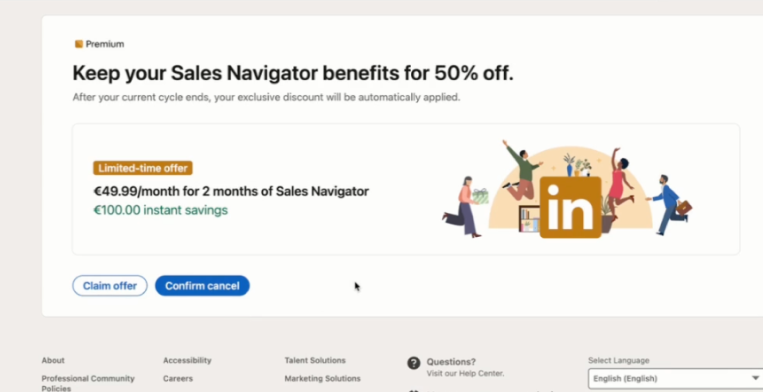
2. LinkedIn Sales Navigator - loss aversion screen
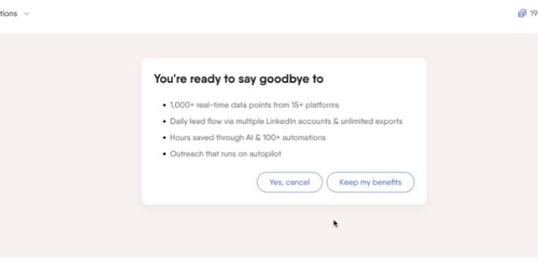
LinkedIn leads with a loss aversion screen showing your Premium features, then immediately offers a 50% discount for 2 months.
What they do well:
- Strong loss aversion screen highlighting Premium features you'll lose
- Aggressive discount offer (50% for 2 months)
What's missing:
- No pause option
- No personalized offer based on cancellation reason or past behaviours
- Exit survey appears after cancellation (high drop-off risk)
- Same discount shown to everyone regardless of why they're leaving
The flow:
- Loss aversion screen (Premium features)
- 50% discount offer
- Exit survey (after cancellation)
- Confirmation
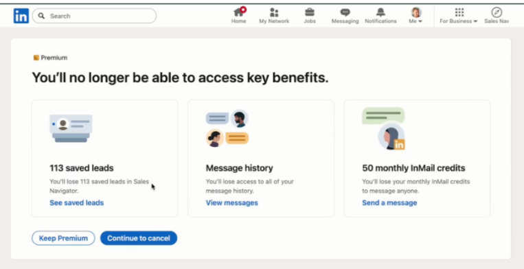
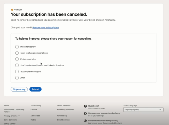
Sales Navigator cancel flow
Steal this: Loss aversion screens work - show what they'll lose. But don't show the same discount to everyone; match offers to reasons.
3. Semrush - education-focused (but too long)
Semrush shows education screens including product training and free tools before asking why you're leaving. Final screen includes a 50% discount.
What they do well:
- Good intent with education screens
- Tries to show value before letting you leave
- Offers discount at the end
What's missing:
- Very hard to find how to cancel, form is hidden behind "contact support"
- Way too long - multiple education screens before the survey
- Exit survey is 4 parts with single choice questions (kills completion)
- 50% discount isn't based on the user's actual reason for leaving
- Not personalized to user needs at all
The flow:
- Education screens (product training, free tools)
- 4-part exit survey
- 50% discount offer
- Confirmation
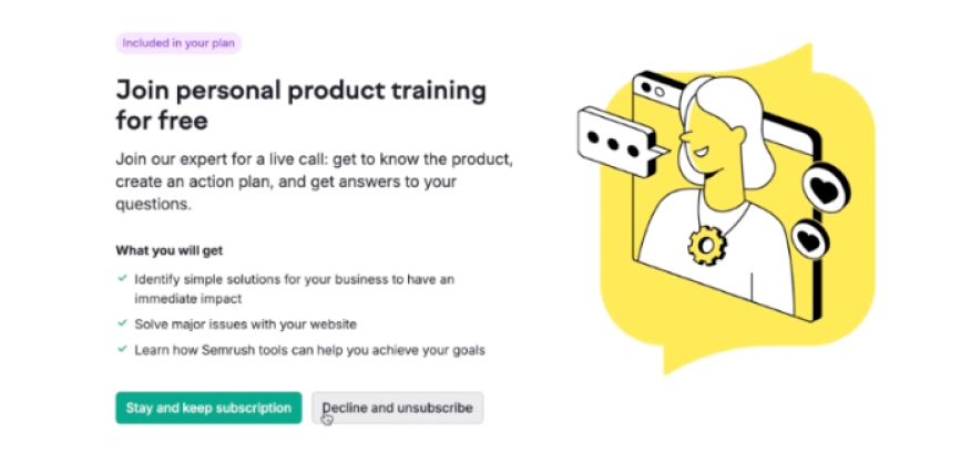
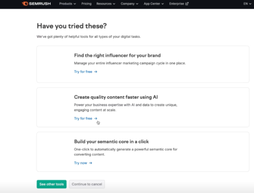
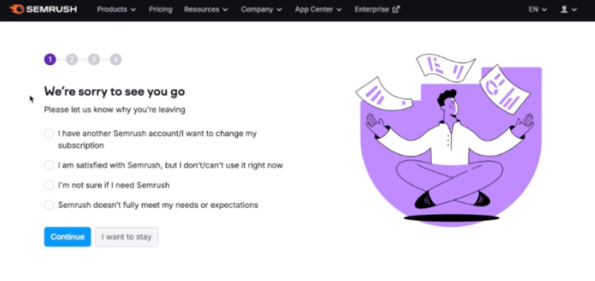
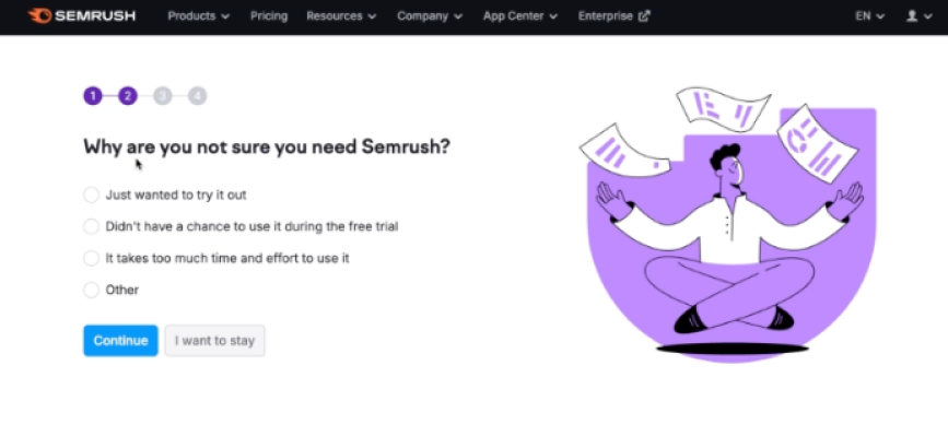
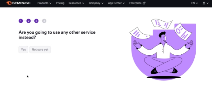
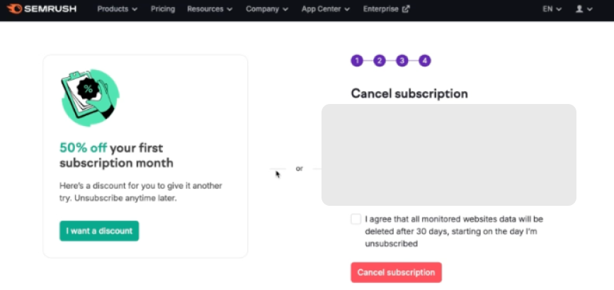
Steal this: Education is good intent, but keep it short. One value screen beats four education screens. And always match your offer to the reason.
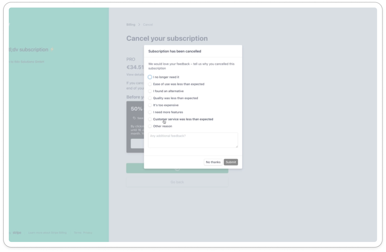
4. tl;dv - best simple flow
Not every product needs a complex cancel flow. tl;dv keeps it short and effective with Stripe's customer portal.
What they do well:
- Clean, non-aggressive design
- Discount offer
- Quick survey (4-5 options max)
- No guilt-tripping language
What's missing:
- Same 50% discount offer for everyone
- Exit survey isn't mandatory
The flow:
- 50% discount offer or cancel
- Done
- (optional) Survey
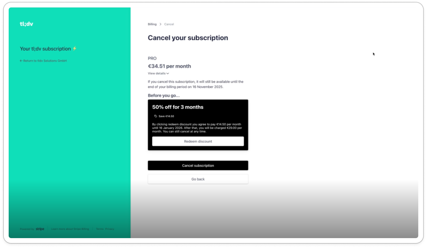
tl;dv cancel flow
Steal this: If you're early-stage or have lower LTV, a simple but well-designed flow beats a complex one that feels over-engineered. Focus on pause options - they're the highest-leverage retention tool for "not using it enough" customers.
5. PhantomBuster - clean but no retention offers
PhantomBuster has a clean design with a loss aversion screen highlighting their main features. But no retention offers in the flow itself.
What they do well:
- Clean, non-aggressive design
- Loss aversion screen showing main features you'll lose
- Direct, no-nonsense language
What's missing:
- No retention offers at all - leaves money on the table
- No pause option
- No discount or downgrade path
The flow:
- Exit survey (9 predefined reasons + open text)
- Loss aversion screen (main features)
- Confirmation
PhantomBuster cancel flow
Steal this: Clean design matters. But always include at least a pause option - you're losing saveable customers without it.
6. YouTube Premium - best pause implementation
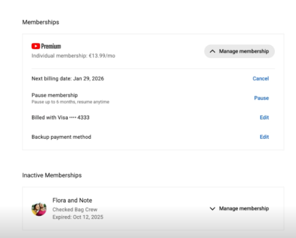
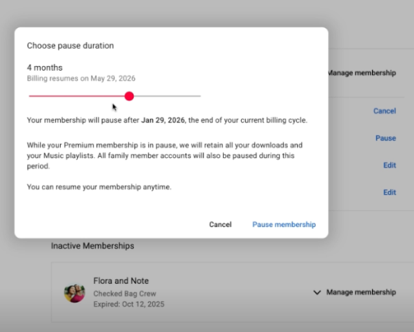
YouTube Premium has no exit survey, but their pause implementation is worth studying. Pause appears right next to cancel, and users can choose their own pause duration.
What they do well:
- Pause shown as equal option next to cancel (smart placement)
- Users choose their own pause duration (full control)
- Value screen shows hours spent watching ad-free YouTube
What's missing:
- No exit survey means no feedback data
- No personalized retention offers
The flow:
- Cancel vs Pause choice
- Pause duration selector (user chooses)
- Value screen (your ad-free hours)
- Confirmation
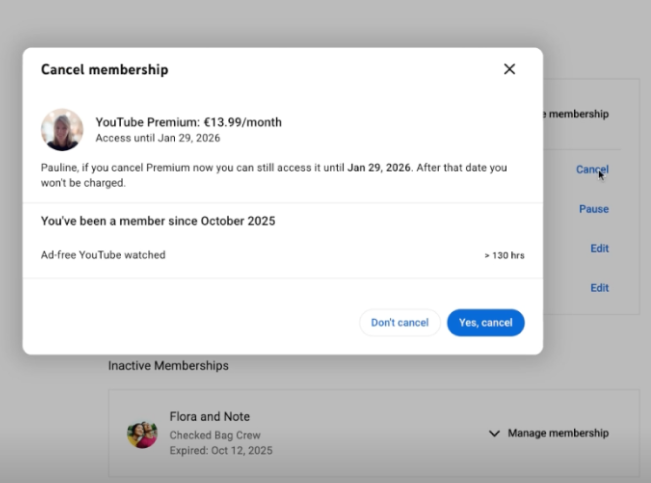
YouTube Premium cancellation flow
Steal this: Let users choose their pause duration. Giving control increases acceptance. And always show a value screen with their actual usage data.
For more cancel flow examples, see our file with 15+ cancellation flows
Cancel flow comparison table
| Company | Value screen | Personalized offers | Pause option | Flow length |
|---|---|---|---|---|
| Canva | Excellent | Yes | Yes (first!) | 4 screens |
| LinkedIn Sales Nav | Good | No (same discount for all) | No | 4 screens |
| Semrush | Education-heavy | No | No | 5-6 screens |
| tl;dv | None | Basic | Yes | 2-3 screens |
| PhantomBuster | Loss aversion | No | No | 3 screens |
| YouTube Premium | Usage-based | No | Yes (user chooses duration) | 4 screens |
Cancel flow benchmarks
What should you expect from a well-designed cancellation flow?
| Metric | Poor | Average | Good |
|---|---|---|---|
| Survey completion rate | <50% | 70-80% | >85% |
| Offer acceptance rate | <5% | 10-15% | 20-30% |
| Overall save rate | <5% | 10-15% | 15-25% |
| Post-save 90-day retention | <40% | 50-60% | >70% |
Important: Watch your post-save retention. If you're saving customers who churn again within 30 days, your offers are attracting the wrong people.
Dark patterns to avoid
Some companies try to reduce churn by making cancellation difficult. This backfires.
What NOT to do:
Hidden cancel buttons: Burying the cancel option deep in settings or requiring customers to find an obscure URL.
Forced phone calls: Requiring customers to call during business hours to cancel. (This is now illegal in many jurisdictions.)
Fake loading screens: Pretending the cancellation is "processing" to add friction.
Guilt-tripping copy: "Are you sure? Your team will lose access and productivity will suffer."
Countdown urgency: "You have 60 seconds to reconsider!"
Why dark patterns backfire:
- Angry customers leave negative reviews
- They warn others on social media and Reddit
- They never come back (burned bridge)
- Regulatory risk is increasing (FTC "click-to-cancel" rules)
A customer who cancels easily and has a good experience might return. A customer who had to fight to cancel never will.
Building your cancel flow for Stripe
If you're using Stripe for subscriptions (most SaaS companies are), you have two options:
Option 1: Build custom
- Create your own cancellation page
- Capture feedback before calling Stripe's cancel API
- Build retention offer logic
- Store and analyze responses
Pros: Full control over design and logic Cons: 40-80 hours of development, ongoing maintenance, edge cases (failed payments, plan changes, etc.)
Option 2: Use a cancel flow tool
Tools like Juttu, Churnkey, and ProsperStack provide pre-built cancel flows that integrate with Stripe.
Pros: Live in hours, proven templates, built-in analytics Cons: Monthly cost, some customization limits
For most teams, a tool makes sense until you hit scale where custom development is justified.
For more comparison, check out 7 best Churnkey alternative tools for SaaS in 2026.
Implementing your cancel flow: a checklist
Ready to build or improve your cancel flow? Here's what to include:
- Exit survey - Open text first, then categories
- Value screen - Show usage metrics before asking why
- Reason-based offers - Map each reason to a specific retention offer
- Pause option - For "not using it enough" customers
- Clean exit - Easy confirmation, no dark patterns
- Data handling - Tell them what happens to their data
- Analytics - Track completion rates, save rates, reasons
FAQ
What is a cancel flow?
A cancel flow (or cancellation flow) is the sequence of screens a customer sees when they try to cancel their subscription. It typically includes an exit survey, retention offers, and a confirmation step.
What's a good save rate for a cancel flow?
Well-designed cancel flows save 15-25% of cancellation attempts. Flows without personalized offers typically save 5-10%. Simple confirmation modals save almost nothing.
Should I require a phone call to cancel?
No. Beyond being a terrible customer experience, requiring phone calls to cancel is now illegal in some jurisdictions (California's "click-to-cancel" law, FTC proposed rules). Make cancellation easy but offer genuine alternatives.
What's the difference between a cancel flow and an exit survey?
An exit survey is one component of a cancel flow - it's the questions you ask to understand why someone is leaving. The cancel flow is the entire experience, including the survey, retention offers, and confirmation.
How long should a cancel flow be?
3-5 screens is typical for subscription SaaS. More screens means more friction, but also more opportunities to save. Find the balance that works for your product and customer base.
Should I show discounts to everyone who tries to cancel?
No. Showing discounts to everyone trains customers to threaten cancellation for discounts. Match your offer to the reason - discounts for price-sensitive churns, pauses for "not using it enough," feature previews for "missing functionality.", call with support for "hard to use / missed value".
Conclusion
Your cancel flow is your last chance to retain a customer. Treat it as a product experience, not an afterthought.
The best cancellation flows share common elements: they capture authentic feedback, remind customers of value received, offer relevant alternatives, and make the exit clean if that's what the customer wants.
Start with a value screen (most underutilized element), add an exit survey with open text, map reasons to offers, and always include a pause option. Track your save rate and post-save retention - the second metric matters more than the first.
Need a cancel flow for your Stripe subscription? Juttu handles exit surveys, personalized retention offers, and value screens - live in under an hour.